The Brief
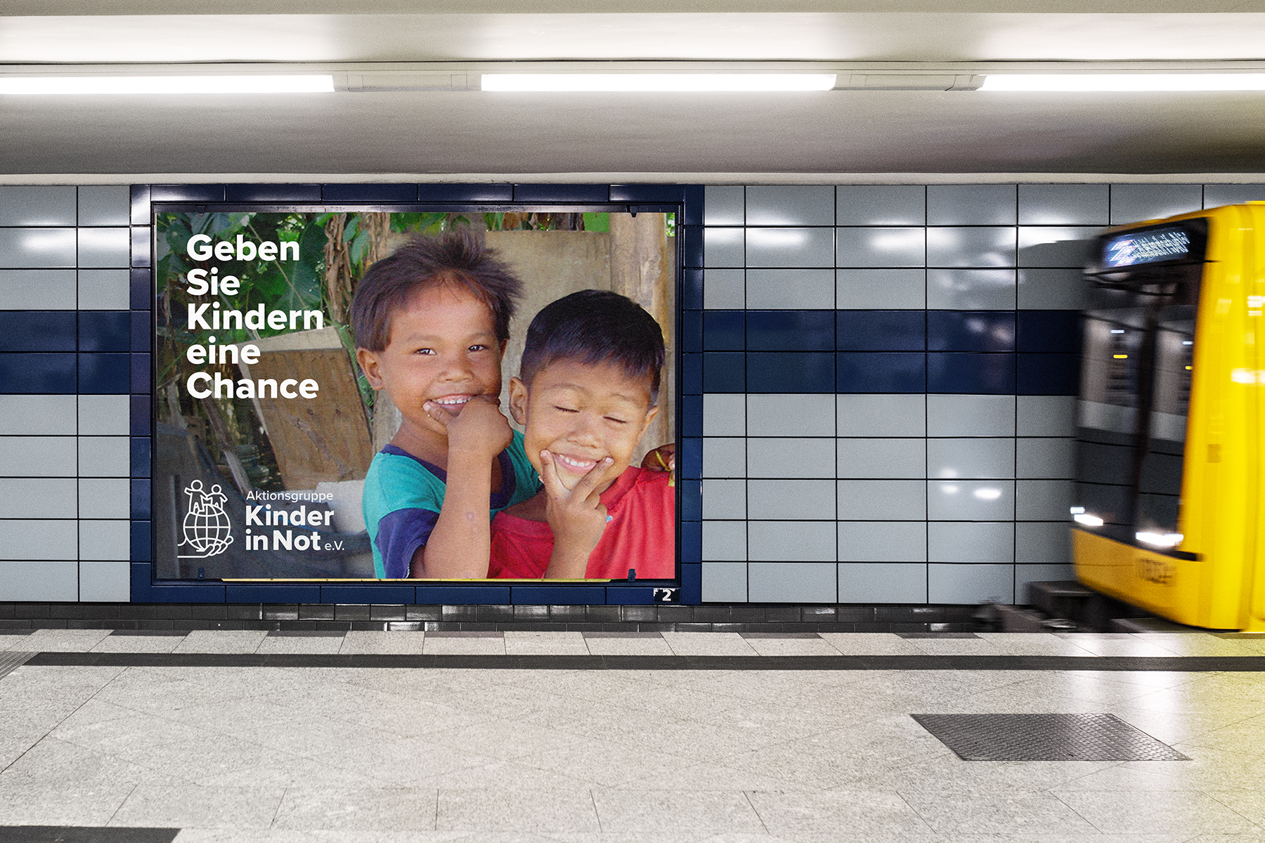
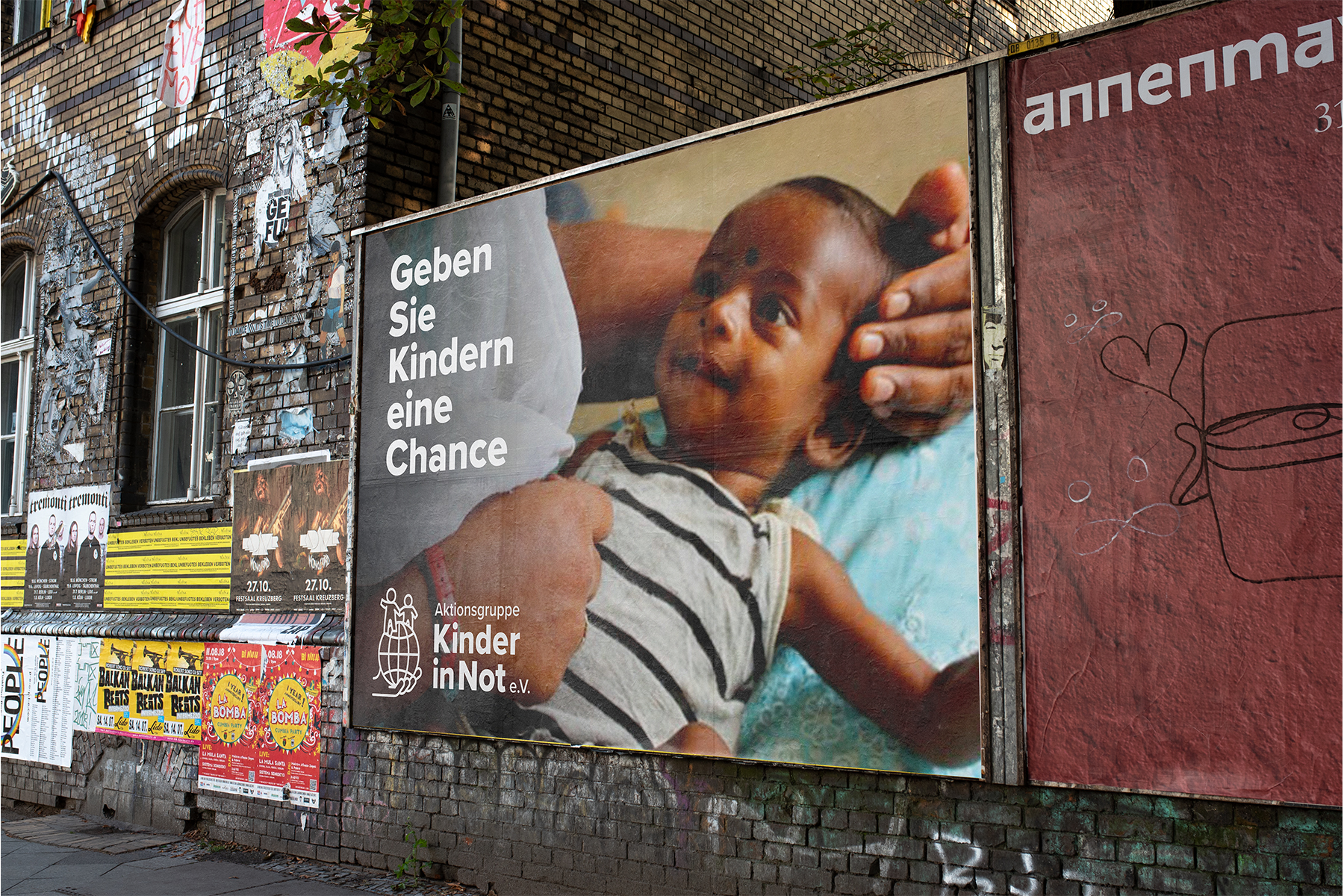
Kinder in Not is a charitable organisation based in Germany and directly translates to ‘Children in Need’. The business performs the same role as the UK equivalent by raising money for disadvantaged children in countries across the world. The team at Kinder in Not approached us to evolve its brand identity after having the same logo and style since its launch.
The Solution
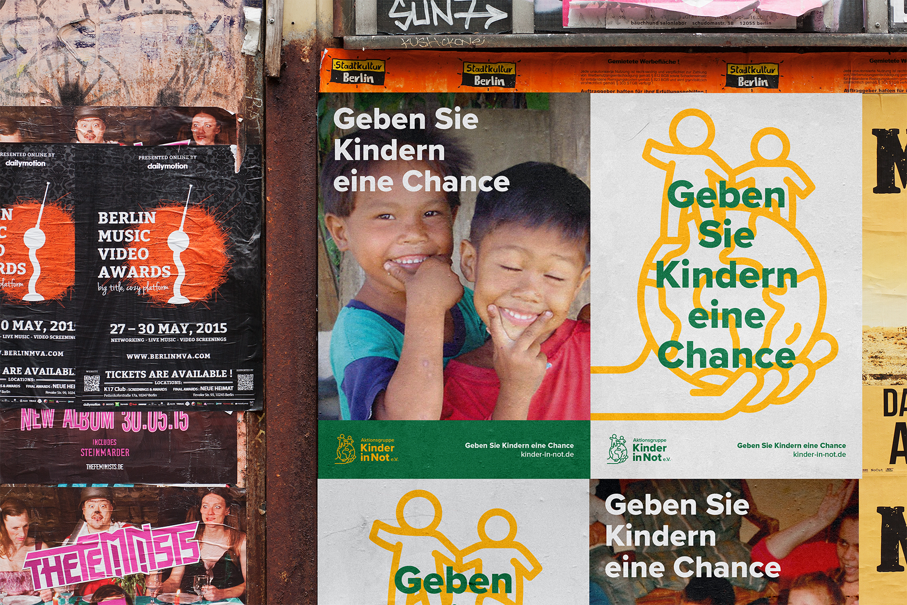
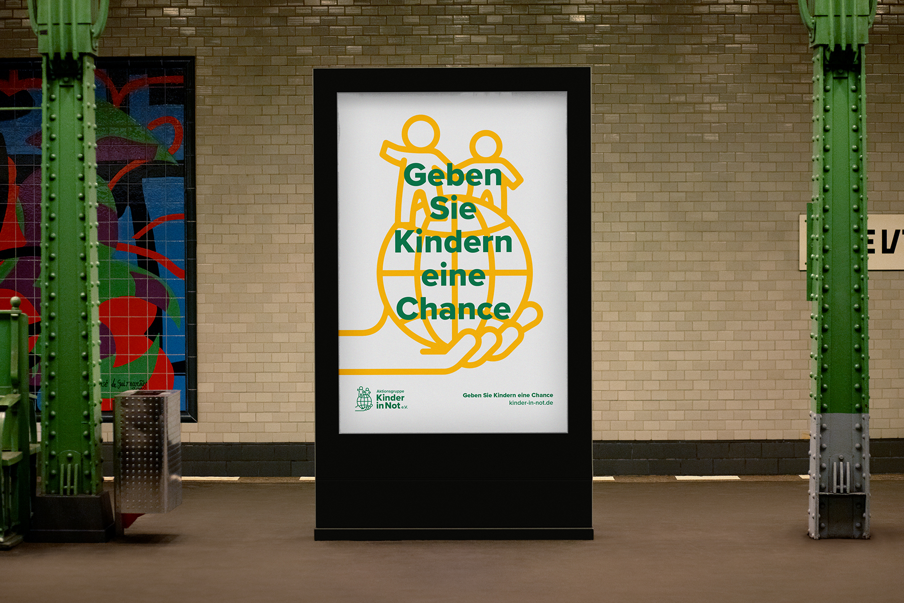
We began by assessing the current brand identity with the client – identifying what needed to be retained within a new logo in order to remain recognisable. We then stripped the logo back to basics to make it more playful and engaging – using a minimalist, illustrated style, with two gender-neutral characters. We also replaced the font with Proxima Nova to modernise the typeface while evolving the brand colours to more vibrant shades of green and yellow. The refreshed identity was well received in consumer research and quickly approved for use by the client team.
Bringing an historic global charity, right up to date.
Through close collaboration with the client and taking the time to understand exactly what the organisation required to take it forward, we were able to establish a fresh and engaging brand identity for Kinder in Not which makes it relevant to today’s global audience.
"The Dairy very quickly, identified and understood the requirements of KiN and managed to fuse them together in a clever and much cleaner logo, which we can now use confidently in all future communications. "
Verena Batchelor
Marketing Manager